Progress report. Choosing a font for my own business card... SO HARD! I feel like my name looks like a third graders, I think its the double t and the double l. Its kind of lyrical looking. And even friendly looking. At first I was going so use a sans serif, but I am completely a serif person. But what serif? The search continues!!!
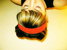
Photo class going well jamie was my lovely model and we were learning about portrait lighting. One is butterfly the other rembrandt. These shots reiterate the common belief that you have to be good looking to go to art school!


Good luck with your search. Personnaly, I'll probably have a Futura extra thin for my card.
ReplyDelete